Saturday, December 10, 2011

Sky Harbor: Airport of Tomorrow

"Sky Harbor, a comprehensive airport and aviation center of the most modern type will soon be placed in operation ... What the highway is to the automobile and the harbor to the yacht, so will Sky Harbor be to Chicago's private aircraft fleet." -- from Aviation: The Next Great Industry, circa 1928.


Sky Harbor Club House, circa 1929
with Gray Goose Air Lines tri-motor sightseeing plane
photo courtesy Northbrook Historical Society

In addition to the skyscraper, the other great symbol of modernity of the early 20th century was the airplane. With the development of aviation technology, mechanized flight became more accessible to the public. In the 1920s investors recognized the commercial potential of airplanes, and aviation businesses sprang-up to carry mail, freight, and passengers.  Soon came the development of airports with new building types: aircraft hangars and airline passenger terminals.

Some of the earliest airfields in Chicago, like short-lived Cicero Field (1911-1916) catered mainly to private aviation enthusiasts. Wooden sheds were built to house airplanes, mechanics, and amenities for pilots and spectators. But by the mid-1920s, more commercial airfields were established and catered to the needs of airmail carriers and passenger lines. Municipal Field (later renamed Midway Airport) in Chicago and Curtiss Field (later renamed Curtiss-Wright) in Glenview sported terminal buildings designed in "modernistic styles" with a spare, almost industrial aesthetic.  The clean lines, flat roofs, smooth surfaces, and ribbon windows of Paul Gerhardt's Municipal Airport terminal are reflective of this more modern aesthetic:

Chicago Municipal Airport, circa 1931
(now demolished)
designed by Paul Gerhardt, Jr., City of Chicago Architect. 
I'll write more on these terminals in the future, but for this post, I'm focusing on one particular airport that opened in Northbrook, Illinois during the summer of 1929: Sky Harbor. It was conceived by the United Aviation Corporation as a kind of "aviation country club" for Chicago's wealthy North Shore residents. Promotional materials touted Sky Harbor as the "airport of tomorrow" designed to accommodate the North Shore's "rich potential of aeronautical development."

Interestingly, the early designs for Sky Harbor were fairly traditional.  The Colonial-style club house looks like it would be at home on the edge of a golf course.  The designs for the hangar were more modern with stepped-back, "Vertical Style" towers flanking an arched opening:

Early designs for Sky Harbor Airport
as published in Aviation: The Next Great Industry
United Aviation Corporation (n.d., but probably 1927 or 1928)
Somewhere along the way, these early designs were replaced by more modern architectural expressions. A Chicago Tribune reporter described the actual built club house as...

"...a picturesque and attractive structure that is both the latest thing in modernistic architecture and also reminiscent of ancient Aztec buildings.  It symbolizes air flight, as it rises higher and higher, diminishing in bulk as an airplane seems to do to the earthbound mortal gazing after a skybound plane."

Sky Harbor club house (under construction), 1929
designed by Alfred P. Allen + Maurice Webster
photo courtesy Library of Congress

Designed by Alfred P. Allen and Maurice Webster "associated architects," the club house was an unusual stylistic and programmatic synthesis.  In aerial photos, its centralized, tower-like design competes with neighboring farm silos to mark its place within the flat agricultural landscape.  Its stepped-platform design is vaguely temple-like and culminated in a two-story lantern that must have been visible for miles at night when lit from within. The first floor contained a waiting room, public facilities, and airport offices.  The second floor housed a restaurant and nightclub (operated by the owners of Perushka's, a downtown Chicago hotspot).  The third floor contained a lounge and rooms for overnight guests.  Wrapping the exterior of the building was a series of terraces which accommodated aviation spectators -- according to the same Chicago Tribune article from 1929, "Night flying, with its searchlights and flares, is an exciting spectacle."


Sky Harbor Club House
as drawn by Alfred P. Allen + Maurice Webster, Associate Architects
and published in American Architect, July 1929


The hangar at Sky Harbor was a completely different architectural expression, perhaps designed by a different architectural firm.  It's elegant, low arch anticipates the Streamline Moderne architecture of the 1930s.

Sky Harbor aircraft hangar (under construction), 1929
architect unknown
photo courtesy Library of Congress

Aerial view of Sky Harbor airport, 1929
Northbrook, Illinois
photo courtesy Library of Congress
Sky Harbor, as an aviation country club, had a very short history.  It opened in June 1929 -- and only six months later, in December 1929, came the stock market crash and the beginning of the Great Depression. Perushka's nightclub soon folded, and the club house was eventually abandoned and later destroyed by fire.

Changing owners several times, Sky Harbor, continued to operate as a small, regional airport until 1973.  Although the runway is long gone and built over by new development, parts of the hangar miraculously survive today.  You can view some good photos (both current and vintage) of the hangar on Paul Freeman's website "Abandoned & Little-Known Airfields."
http://www.airfields-freeman.com/IL/Airfields_IL_Chicago_N.htm

Special thanks to Judy Hughes of the Northbrook Historical Society.

Sources include:

Aviation: The Next Great Industry, promotional booklet published by United Aviation Corporation, n.d., circa 1928.

"'All Airplanes Lead to Chicago': Airport Planning and Design in a Midwest Metropolis" by David Brodherson and published in Chicago Architecture and Design, 1923-1993, pages 75-97.

"Night Flying at Sky Harbor" and "Ideal Landing Field", Chicago Tribune, 7 July 1929.


Monday, November 14, 2011

New school meets old

My last post ended with a photo of 333 N. Michigan Avenue.  Designed by the firm of Holabird + Root and completed in 1928, 333 N. Michigan was described by Carl Condit as "the decisive step in breaking with the past and reintroducing to Chicago the modern skyscraper."

333 N. Michigan Ave

But what precipitated the design of 333 N. Michigan and the "modern skyscrapers" to follow?  Some of the winning entries from the Tribune Tower competition of 1922 were influential on its design.  But Holabird + Roche (the firm that would become Holabird + Root in 1928) set a precedent with the Lumber Exchange Building, commonly referred to as Roanoke Tower (after an earlier building that once occupied the site). The tower portion, completed in 1925, was the first Chicago skyscraper to incorporate stepped massing and restrained ornament. As such, it became a harbinger of the modern "Vertical Style" as uniquely expressed in Chicago in the late 1920s and early 1930s, including 333 N. Michigan Avenue.

Postcard of Roanoke Tower
Building designed by Holabird + Roche, 1925

The Lumber Exchange Building / Roanoke Tower is a bit of a strange hybrid with a complex history of additions and renovations.  Now known simply as 11 South LaSalle Street, it began life in 1915 as a classic, 16-story Chicago School office tower designed by Holabird + Roche. In 1922, a 5-story addition was added  (again, designed by Holabird + Roche).  With the enactment of the 1923 zoning ordinance allowing for taller office towers, the owners of the Lumber Exchange Building decided to build a 37-story addition to the back of the original 1915 structure.  Here's a photograph of the tower taken a few years after its completion in 1925 including the "aerial beacon" that served as a warning for nighttime pilots:

Roanoke Tower, circa 1928
with Foreman State National Bank under construction (left)
and the spire of the Chicago Temple visible in background (right)
Photo courtesy the American Memory Project, Library of Congress

Although Holabird + Roche were the architects of note, the firm had contracted with an outside architect, Andrew Rebori, to design the tower itself.  Rebori designed the lower floors of the tower to seamlessly blend with the architectural style of the original 1915 building.  But his design for the upper stories of the tower boldly contrast with the old "Chicago School" office block. Rebori designed the projecting tower as series of set-backs, gradually culminating in a penthouse that served as a platform for the aerial beacon.  Although the decorative flourishes on the upper stories reflect the historically derived details of the older structure, the tower itself is remarkably restrained in its use of ornament.

Today, almost lost in a sea of newer office towers, the building is somewhat difficult to photograph at street level.  But the following photos give a sense of the tower's ornament, stepped massing, and relationship to the older structure at its base:


The 1923 zoning ordinance was hugely influential in determining the shape of the addition, especially the tower's relationship to the older office block.  The ordinance allowed for the main office block to rise to a height of 260 feet above street level. Additional floors built above the 260-foot height limit were permitted if they took-up 25% or less of the building's overall footprint and made-up only 1/6 of the building's overall volume -- hence the slender proportions of the Roanoke Tower addition.

This particular formula created very distinctive skyscraper designs in Chicago during the 1920s and 1930s.  Essentially, two types emerged, largely dictated by a building's lot size: "Office Block + Projecting Tower" (like the Lumber Exchange / Roanoke Building) and  "Throne Chair" (like the Chicago Board of Trade Building) ...


... more on these two types to follow in future posts.  The next post, however, will look at another expression of modernity of the late 1920s and early 1930s: Chicago's first airports.

Sources for this post include:

Carl Condit, Chicago 1910-1920: Building, Planning, and Urban Technology, pp 118-119.

Pauline Saliga, The Sky's the Limit: A Century of Chicago Skyscrapers, pp 83-84.

Carol Willis, "Light, Height, and Site: The Skyscraper in Chicago" in Chicago Architecture and Design: 1923-1993, p 130.

Sunday, November 6, 2011

A tale of two skyscraper designs

The Chicago Tribune Tower Competition of 1922 is often cited by architectural historians as a major influence on the design of Chicago skyscrapers during the late 1920s and early 1930s.  And in some ways, it was.  The second place entry by Eliel Saarinen, for example, is mentioned extensively as being more influential and "forward looking" than the winning entry by the firm of Howells + Hood.

However, I agree with the assessment of Carol Willis that too much emphasis has been placed on Saarinen's entry.  In her essay "Light, Height, and Site: The Skyscraper in Chicago" (published in Chicago Architecture and Design, 1923-1993) Willis states that Saarinen's competition entry "has been emphasized far too much" as a formal model for Chicago's skyscrapers of the 20s and 30s.  I would go even further and venture that if any of the competition entries are to be noted for their formal influence, it should be Bertram Goodhue's instead of Eliel Saarinen's.

Here are Goodhue's and Saarinen's entries displayed side-by-side:

Two entries to the Chicago Tribune Tower Competition
Bertram Goodhue's entry (left) received honorable mention & Eliel Saarinen's entry (right) received second prize.

The main similarity between these two entries--and many of the other entries--is the architects' use of stepped massing.  Each design incorporates a series of set-backs that produce a tapered silhouette. This was a defining characteristic of tall office towers of the late 20s and 30s, not just in Chicago, but in New York and other cities as well.

The elegant massing of these skyscrapers, however, was not a purely formal exercise.  Their tapered designs were influenced by market forces and zoning ordinances as much as by aesthetic concerns.  In her published works, Willis writes about "economic height." Skyscrapers were seen by developers as "machines that make the land pay."  By building taller office towers, a developer could gain a greater return on an initial investment on an expensive piece of property.  Civic concerns about unrestricted building heights led to zoning ordinances in both New York (1916) and Chicago (1920 and 1923) that governed building heights and massing.  Greatly simplified, these ordinances allowed a skyscraper to rise above a particular height limit provided that the mass of the building gradually tapered, ostensibly to allow more light and air into the streets below.

Both Goodhue's and Saarinen's designs for the Tribune Tower follow the same basic formula governing height and massing.  Saarinen's design often scores more points with critics and scholars for its elegant proportions, flat-topped roof, and deep set windows accentuated by unbroken vertical piers. This vertical emphasis produces an illusion that the building is taller than it actually is while still adhering to the prescribed height/mass ratio. Saarinen's competition entry also receives more attention simply because it won second prize and is therefore better know -- Goodhue's entry is often overlooked in a sea of 50 entries that received honorable mentions.

I would argue, however, that Goodue's competition entry was ultimately more influential than Saarinen's. Most striking is Goodhue's flattened surface treatment and simple lines which anticipate the Streamlined Moderne. The building's smooth limestone exterior, reductive forms, chamfered corners (in the upper stories), and understated ornament add to the design's clean, modernistic aesthetic. Indeed, this aesthetic is reflected in Goodhue's two most important built works of the period: the Nebraska State Capitol (1920-1932) and the Los Angeles Public Library (1921-1926).

If you were to lop-off the the more decorative aspects of the penthouse of Goodhue's Tribune Tower, his design begins to resemble the signature style of Holabird + Root's skyscrapers of the late 1920s. Here's a period photo of 333 N. Michigan:

333 N. Michigan Avenue (1928)
Holabird + Root
In contrast to Goodhue's competition entry, Saarinen's  looks a bit old-fashioned with its historically-derived Gothic detailing, ribbed surface treatment, and decorative finials that protrude above the building's massing. However, Saarinen's entry did inspire several Chicago skyscrapers that featured Gothic ornament including the Pittsfield Building (1927), Mather Tower (1928), and the Steuben Club Building (1929). These buildings definitely receive much less attention from scholars than their more modernistic (in terms of detailing) cousins.

Which was the first office tower built in Chicago to incorporate the new stepped massing in its design?  More on that in the next post.

Sunday, October 30, 2011

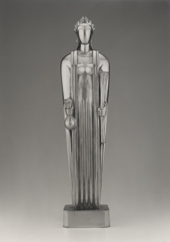
Machine Age goddess

©The Art Institute of Chicago 

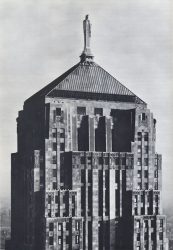
Full disclosure: the title of this post was inspired by Debra Bricker Balken's  John Storrs: Machine-Age Modernism (Boston Athenaeum, 2010). John Storrs is best known in Chicago for having created Ceres, the 35-foot tall cast aluminum goddess perched atop the Chicago Board of Trade building. Storrs designed the sculpture as an extension of the architecture: Ceres' streamlined form and long vertical lines echo and compliment the lines of the building  The photo (at left) is of a 26-inch tall chrome steel maquette of Ceres (1928) in the collections of the Art Institute of Chicago.


Below is a photo from about 1930 -- the year the Chicago Board of Trade building was completed -- showing Ceres within her intended architectural context:

photo courtesy www.johnstorrs.org

The Chicago Board of Trade building was designed by the Chicago firm of Holabird + Root and replaced an older CBoT building designed by W. W. Boyington from 1885.  Where the Boyington design was Victorian eclectic, the new Holabird + Root design was reflective of the "Vertical Style" (what we might categorize as Art Deco skyscraper design today) considered the height of modernity in the late 1920s.

The Holabird + Root CBoT building seamlessly integrates sculpture with architecture.  Indeed, the late historian David Gebhard considered this characteristic a hallmark of Art Deco architecture where "three dimensional figures were made to spring forth in primeval fashion from the surface and mass of the structure." The CBoT sculptural program was designed by artist Alvin Meyer and includes allegorical figures of wheat and corn (two agricultural commodities that are traded inside the building) that do, indeed, seem to "spring forth" from the facade of the building:


Gebhard also writes that Deco architecture "frequently enlisted sculpture in its game of playing tradition against modernity."  John Storrs was a master of this game.  He designed Ceres as a synthesis of classical and modern forms.  The sculpture is figural, yet reductive.  She represents the ancient Roman goddess of agriculture, yet is created from a Machine Age material: aluminum. Ceres is symmetrical and proportioned like a classical statue, but her abstracted form reflects more modern influences, like the work of Storr's friend and fellow artist, Constantin Brancusi.

Similarly, the buildings of Holabird + Root of the late 1920s and early 1930s reflect a modernizing of traditional forms. John Holabird was the son of Chicago School architect William Holabird and studied in Paris at the Ecole des Beaux Arts.  While there, he met John Wellborn Root, Jr., the son of Chicago architect John Wellborn Root, Sr. (of Burnham + Root fame).  Although both young architects were grounded in the traditional education system of the Beaux Arts academy, their worked eventually evolved beyond emulating classical structures and historical styles.  They retained some Beaux Arts design principles -- like symmetrical floor plans, solid massing, and classical proportioning systems -- but merged these with modern, reductive forms and architectural ornament that wasn't historically derivative.  The Holabird + Root signature aesthetic of this period featured streamlined limestone facades in large-scale projects such as 333 N. Michigan (1928), the Daily News Building (1929), and the Palmolive Building (1929). The designs of these buildings also integrated architectural sculpture and murals by avant-guarde artists like Storrs and John Norton

More on Holabird + Root and the murals of John Norton in future posts.

Sources for this post include:

Debra Bricker Balken,  John Storrs: Machine-Age Modernism (Boston Athenaeum, 2010).

David Gebhard, The National Trust Guide to Art Deco in America (New York, John Wiley & Sons, 1996).

www.johnstorrs.org

Tuesday, October 25, 2011

1918 and 1948: two ends of the spectrum

Below are photos of two architectural works from either end of the Modern Before Mies chronology:

  • Pennsylvania Railroad Freight Terminal (1918)                                                                 designed by the Philadelphia firm of Price + McLanahan
  • “Wheels a-Rolling” stage set (1948)                                                                                  designed for the Chicago Railroad Fair by the firm of Shaw Metz + Dolio.

Both photos are from the Charles W. Cushman Photography Collection at the University of Indiana Archives. The Cushman collection is unusual in that it contains hundreds of early color photos from a time period when most photographers were using black and white film.  Many of Cushman’s images capture an immediacy that is often absent from professional architectural photos.

(c) Cushman Photography Collection, University of Indiana

Cushman’s photo of the Penn Freight Terminal (pictured above, the building in the middle ground with the clock tower and sign stating "Western Warehousing Co.") was snapped on November 8, 1942 more than 24 years after it was completed.  Housing 1,500,000 square feet of storage space on five levels, the Penn Freight Terminal was colossal.  It was an integral part of the master plan that consolidated several railways to form Chicago’s Union Station located just north of the Freight Terminal’s site.

Along with the railroad yards in the vicinity of Taylor and Canal Streets, Cushman’s photo also captures an unusual view of the Chicago skyline. The vantage point is from the southwest looking toward a mid-20th century Loop that is punctuated by “Vertical Style” office towers from the late 1920s and early 1930s.

The clock tower on the Penn Freight Terminal is the first example of a tall structure in Chicago that incorporated a series of setbacks in its design.  As such, it anticipated the trend in skyscraper design of the 1920s and 1930s largely influenced by new zoning codes that mandated tapered massing in tall office towers.  It’s interesting to note some of the similarities between the Price + McLanahan clock tower (completed in 1918) and the Holabird + Root Board of Trade Building (completed in 1930).

(c) Cushman Photography Collection, University of Indiana

Cushman’s photo of the “Wheels a-Rolling” performance (pictured above) was taken on September 13, 1948.  The image presents a striking contrast between an antique train from the 1840s with an uber-modern stage set design from the late 1940s.

“Wheels a-Rolling” was the centerpiece of the Chicago Railroad Fair of 1948 and 1949 which celebrated the centennial of Chicago’s first railways.  It was a historical pageant illustrating progress in land transportation with an emphasis on the benefits of train travel (not unexpected, given that the fair was sponsored by all the major railroad companies)

The firm of Shaw Metz + Dolio designed not only the stage set and grandstand for “Wheels a-Rolling,” but also the master plan for the fair itself.  The fairgrounds stretched along the lake front south of the present-day Museum Campus. The fair’s main entrance was at 23rd Street and Lakeshore Drive approximately where McCormick Place Lakeside Center is located today.

Little (if anything) has been published about the design of the fair.  However, photos of the fair show that modern design was alive and well in Chicago in the late 1940s before any of Mies’ apartment towers were completed.  More remarkable is that Alfred Shaw, a partner and principal architect at Shaw Metz + Dolio, got his start at the very conservative firm of Graham, Anderson, Probst + White, yet his own firm was designing progressive works like the Chicago Railroad Fair and the Florsheim Shoe Company of the late 1940s.  SM+D went on to design other influential modern buildings in the 1950s.

In between the completion of the Penn Freight Terminal in 1918 and the Chicago Railroad Fair of 1948, a range of influential buildings were constructed in and around Chicago.  Future posts will document the different concepts of what constituted “modern” architecture and design in Chicago during this time period.

The Pennsylvania Railroad Freight Terminal was razed sometime after 1973.  And the Chicago Railroad Fair met its demise in 1950. (As with many fairs, the buildings were designed to be temporary. The SM+D stage set was constructed of a wood frame covered in painted plywood and masonite. The overall effect, however, reads as reinforced concrete.)  If you have more information about either project—especially from primary source materials—feel free to contribute to this blog.  I plan to write more about each building in more detail in future posts.

Sources for the above post:

Condit, Carl.
Chicago 1910-1929: Building, Planning, and Urban Technology
(University of Chicago Press: Chicago, 1973) pages 265-268.

Thomas, George E.
William L. Price: Arts & Crafts to Modern Design
(Princeton Architectural Press: New York, 2000)

Chicago Railroad Fair: Official Guidebook, 1949.


Chicago Railroad Fair Records at the University of Illinois at Chicago Archives.

Tuesday, October 18, 2011

Calling all architecture geeks...

…both amateur and professional.

This blog is an experiment in public participation in architectural history. I’m inviting readers to contribute what they know of the buildings and projects documented on this site.  Some are rather obscure, and the information is often difficult to locate, especially primary source material.  Please feel free to contribute links, texts, and images (especially vintage photos) related to the works documented on this blog.  And of course, cite your sources!

Sky Harbor hanger, 1929        photo courtesy Northbrook Historical Society

The following is a partial list of buildings and projects—reflective of the time period between 1918 and 1948—that I hope to document in upcoming postings. Some of these works are fairly well known. Others not so much.  But this will be the first time that all will be documented in one place, allowing the works to be viewed collectively by a public audience.

Pennsylvania Railroad Freight Terminal, Price + McLanahan,1918
Bertram Goodhue’s Tribune Tower Entry, 1922
National Life Insurance Building, Frank Lloyd Wright, 1924
Roanoke Tower, Andrew Rebori with Holabird + Roche, 1925
333 N. Michigan Avenue, Holabird + Root, 1928
Sky Harbor Airport, Allen + Webster, 1929
Daily News Building, Holabird + Root, 1929
Adler Planetarium, Ernst A. Grunsfeld, 1930
Chicago Board of Trade, Holabird + Root, 1930
Carbide and Carbon, Burnham Bros., 1930
Merchandise Mart, GAPW, 1930
A.O. Smith Research, Holabird + Root,1930
Astor Street Apartment Buildings, Philip B. Maher, 1931-1932
Chrysler Exposition Building, Holabird + Root, 1933
House of Tomorrow, Keck + Keck, 1933
Italian Pavilion, Aldaberto Libera, 1933
General Exhibits Group, 1933
Crystal House, Keck + Keck, 1934
Field Building, GAPW, 1934
Fisher Apartments, Andrew Rebori,1937
Gottschalk-Keck Apartments, Keck + Keck,1937
Campana Factory, Frank D. Chase with Childs + Smith, 1938
Clark-Maple Gas Station, Bertrand Goldberg,1938
North Pole Ice Cream, Bertrand Goldberg, 1938
Madonna della Strada, Andrew Rebori, 1939
IIT campus, Mies Van der Rohe, 1940s

The above list is a work in progress—it’s likely to change over time.  Stay tuned for the first posting on an actual building: Will Price’s Pennsylvania Railroad Freight Terminal of 1918.  This one was a shocker to me on many levels, but primarily because it remains so obscure today.

Wednesday, October 5, 2011

The (so-called) Lost Years


                            Chrysler Motors Building, Holabird + Root, 1933    photo (c) Hedrich Blessing
1918 marked the end of an era in Chicago architecture and design. It was the year that Louis Sullivan closed his offices in the Auditorium Building. It was also the year that Elmslie & Purcell completed the Woodbury County Courthouse in Sioux City, Iowa, regarded as the last great work of the Prairie School.

1918 witnessed changing times and changing tastes that brought an end to the First Chicago School of architecture.

Thirty years later, in 1948, Ludwig Mies van der Rohe completed his first major commercial building in Chicago, the Promontory Apartments. Designs for his more famous 860-880 Lake Shore Drive apartments were still in development. The success of these two high-rise residential projects—coupled with Mies’ influential design courses and work at the Illinois Institute of Technology—laid the foundations for the Second Chicago School of architecture.

But what was happening in Chicago architecture and design between the First and Second Chicago Schools? (1918 through 1948) Conventional histories often regard this period as a kind of hiatus in which little of architectural significance was produced in Chicago. Adding to this perception is Sullivan’s often cited prediction that “The damage wrought by the World’s Fair will last from a half a century from its date, if not longer,” lending authority to a “step backwards” in Chicago architecture until the arrival of Mies and his brand of European Modernism.

A closer examination of the historical record, however, reveals that the period between the First and Second Chicago Schools was actually one of great creativity, innovation, and even modernization of more traditional approaches to design. Modern architecture in Chicago was not dead between 1918 and 1948. On the contrary, architects and designers experimented with multiple interpretations of “modern” during this time.

Contemporary writers, reviewers, and critics used the term “modernistic” to describe different expressions of modern architecture in the 1920s and 1930s. Modern Before Mies aims to document these Chicago projects that prepared the way for Mies and laid the foundations for the city we know today.